
Saturday, 31 December 2011
Wednesday, 28 December 2011
Friday, 16 December 2011
About the alternative ending
While we were on the set of our film we decided to end the film a little differently, so that our film wouldn't follow the codes and conventions of an actual film. We decided that instead of Sarah and Max making up at the end, we should get Max to reject Sarah's attempt to patch things up with him. We made this the ending of our main film, but we still shot the scenes in which Sarah and Max make up. We then decided to make the scene when Sarah and Max make-up, part of our alternative ending, We then posted both on Youtube in order for us to see which one got the most views. This is the result of our alternative ending.
Tuesday, 6 December 2011
Poster evaluation
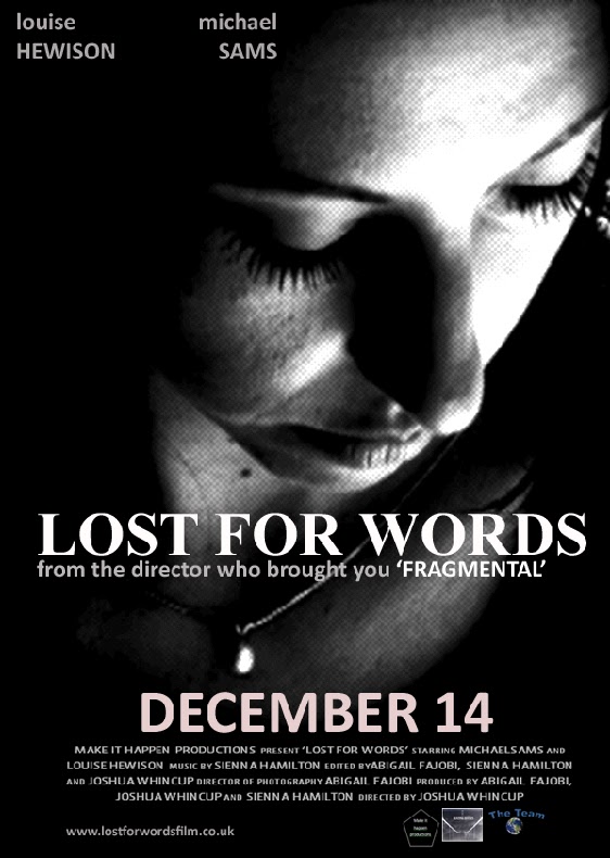
The colours I used in the poster are quite dismal colours or dark colours that have been used in order to emphasise the theme of grief in the film. The colours used for the text also relates to the theme of grief seeming as it’s in black and white, which are sad and plain colours, which is why they are used in almost all the posters. The main colours in the background for all of the posters are black. The main image for most of the images is of Sarah (Louise Hewison) whose facial expression clearly shows that she’s upset, which highlights the theme of grief once again. Even one of the posters is quite abstract so you can really see the grief of Sarah coming through. I think the intended audience for this poster people of the age of 16+. I think that due to the fact that the image chosen has so much emotion radiating from it; people would want to see the film. This would have been more effective if the character chosen for the poster was famous because audiences would have been more interested. I can tell that the movie is a drama due to the poster. The words “from the director who brought you fragmental” would engage the audience, especially if they saw ‘Fragmental’ and liked it. This quote also suggests that the director is good seeming as I decided to quote him in the film poster. It also makes both films more popular seeming as if people like “lost for words” they would be interested in watching “fragmental” and visa versa. The poster doesn’t promise you anything specifically, but by mentioning the directors name you are promised a visually good film in terms of directing.
Thursday, 1 December 2011
Credits for film

This is an image of the credit block I included in all of my posters in order to make my posters more realistic. The picture also includes the logo's of company's I made up that are meant to be associated with the actual film. I made these logo's using paint, word and Photoshop. After making the first poster I could just copy and paste the logo's and credit block from word onto my other posters.
Poster 6
This is the one of the first posters that I made. This poster isn't completely finished because half-way through I realised that this poster didn't suit the world of our film. It looked like a poster for a thriller or horror movie instead of a drama. It was due to this poster that I took the initiative to do more research in order for me to be able to figure what the codes and conventions of a drama poster were. This helped to make other posters that were more relevant to my film.
T


Subscribe to:
Comments (Atom)